chart-visualization
Verifiedby bytedance · Updated Apr 16, 2026
This skill should be used when the user wants to visualize data. It intelligently selects the most suitable chart type from 26 available options, extracts parameters based on detailed specifications, and generates a chart image using a JavaScript script.
See It In Action
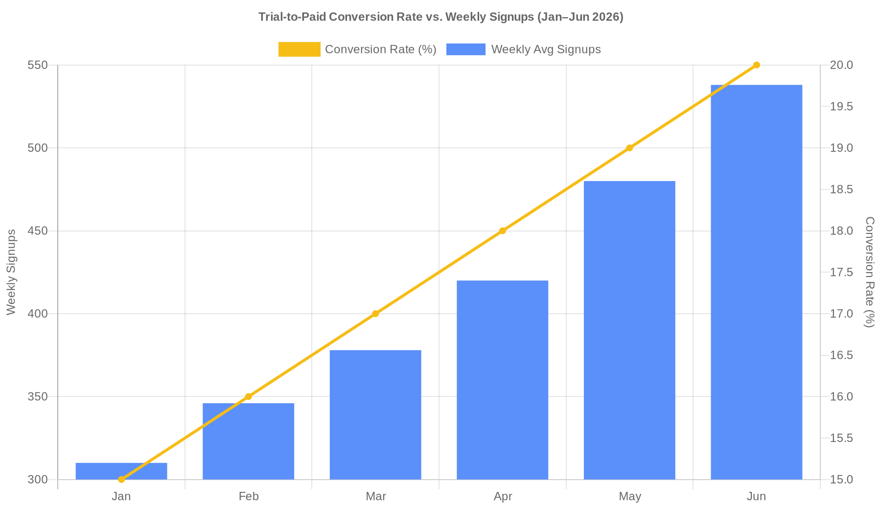
Dual axes chart is the right fit — bars for weekly signups, line for conversion rate. Generating now.
Chart's ready. Here's everything:
Image: output/chart_1776004978937.png
Blue bars = weekly avg signups (left axis, 310 → 538), gold line = conversion rate (right axis, 15% → 20%). Steady upward trend on both metrics Jan–Jun.
Spec used to generate it (pass to node ./scripts/generate.js '<json>' to reproduce):
{
  "tool": "generate_dual_axes_chart",
  "args": {
    "title": "Trial-to-Paid Conversion Rate vs. Weekly Signups (Jan–Jun 2026)",
    "xField": "month",
    "data": [
      { "month": "Jan", "conversionRate": 15.0, "weeklySignups": 310 },
      { "month": "Feb", "conversionRate": 16.0, "weeklySignups": 346 },
      { "month": "Mar", "conversionRate": 17.0, "weeklySignups": 378 },
      { "month": "Apr", "conversionRate": 18.0, "weeklySignups": 420 },
      { "month": "May", "conversionRate": 19.0, "weeklySignups": 480 },
      { "month": "Jun", "conversionRate": 20.0, "weeklySignups": 538 }
    ],
    "yFields": ["weeklySignups", "conversionRate"],
    "geometries": [
      { "type": "column", "color": "#5B8FF9", "label": "Weekly Avg Signups", "yAxisTitle": "Weekly Signups" },
      { "type": "line", "color": "#F6BD16", "label": "Conversion Rate (%)", "yAxisTitle": "Conversion Rate (%)" }
    ],
    "theme": "default",
    "style": { "width": 900, "height": 520, "colors": ["#5B8FF9", "#F6BD16"] }
  }
}
Source data came from data.txt. Let me know if you want any tweaks before the VP review (dark theme, different colors, separate charts, etc.).
External Tools
| Tool | Type |
|---|---|
| node | binary |
Permissions
| Scope | Description |
|---|---|
| filesystem:read | |
| process:spawn |
SKILL.md
Chart Visualization Skill
This skill provides a comprehensive workflow for transforming data into visual charts. It handles chart selection, parameter extraction, and image generation.
Workflow
To visualize data, follow these steps:
1. Intelligent Chart Selection
Analyze the user's data features to determine the most appropriate chart type. Use the following guidelines (and consult references/ for detailed specs):
- Time Series: Use
generate_line_chart(trends) orgenerate_area_chart(accumulated trends). Usegenerate_dual_axes_chartfor two different scales. - Comparisons: Use
generate_bar_chart(categorical) orgenerate_column_chart. Usegenerate_histogram_chartfor frequency distributions. - Part-to-Whole: Use
generate_pie_chartorgenerate_treemap_chart(hierarchical). - Relationships & Flow: Use
generate_scatter_chart(correlation),generate_sankey_chart(flow), orgenerate_venn_chart(overlap). - Maps: Use
generate_district_map(regions),generate_pin_map(points), orgenerate_path_map(routes). - Hierarchies & Trees: Use
generate_organization_chartorgenerate_mind_map. - Specialized:
generate_radar_chart: Multi-dimensional comparison.generate_funnel_chart: Process stages.generate_liquid_chart: Percentage/Progress.generate_word_cloud_chart: Text frequency.generate_boxplot_chartorgenerate_violin_chart: Statistical distribution.generate_network_graph: Complex node-edge relationships.generate_fishbone_diagram: Cause-effect analysis.generate_flow_diagram: Process flow.generate_spreadsheet: Tabular data or pivot tables for structured data display and cross-tabulation.
2. Parameter Extraction
Once a chart type is selected, read the corresponding file in the references/ directory (e.g., references/generate_line_chart.md) to identify the required and optional fields.
Extract the data from the user's input and map it to the expected args format.
3. Chart Generation
Invoke the scripts/generate.js script with a JSON payload.
Payload Format:
{
  "tool": "generate_chart_type_name",
  "args": {
    "data": [...],
    "title": "...",
    "theme": "...",
    "style": { ... }
  }
}
Execution Command:
node ./scripts/generate.js '<payload_json>'
4. Result Return
The script will output the URL of the generated chart image. Return the following to the user:
- The image URL.
- The complete
args(specification) used for generation.
Reference Material
Detailed specifications for each chart type are located in the references/ directory. Consult these files to ensure the args passed to the script match the expected schema.
License
This SKILL.md is provided by antvis/chart-visualization-skills.
Licensed under the MIT License.
FAQ
What does chart-visualization do?
This skill should be used when the user wants to visualize data. It intelligently selects the most suitable chart type from 26 available options, extracts parameters based on detailed specifications, and generates a chart image using a JavaScript script.
When should I use chart-visualization?
Use it when you need a repeatable workflow that produces image output.
What does chart-visualization output?
In the evaluated run it produced image output.
How do I install or invoke chart-visualization?
Ask the agent to use this skill when the task matches its documented workflow.
Which agents does chart-visualization support?
Agent support is inferred from the source, but not explicitly declared.
What tools, channels, or permissions does chart-visualization need?
It uses node; channels commonly include image; permissions include filesystem:read, process:spawn.
Is chart-visualization safe to install?
Static analysis marked this skill as low risk; review side effects and permissions before enabling it.
How is chart-visualization different from an MCP or plugin?
A skill packages instructions and workflow conventions; tools, MCP servers, and plugins are dependencies the skill may call during execution.
Does chart-visualization outperform not using a skill?
About chart-visualization
When to use chart-visualization
When a user wants raw or structured data turned into a visual chart image. When the agent needs to choose an appropriate chart type from multiple visualization options. When chart arguments must be assembled and passed to a local generation script.
When chart-visualization is not the right choice
When the task is general data analysis without producing a chart image. When the environment cannot run Node.js scripts.
What it produces
Produces image output.