data-storytelling
Verifiedby wshobson · Updated Apr 16, 2026
Transform data into compelling narratives using visualization, context, and persuasive structure. Use when presenting analytics to stakeholders, creating data reports, or building executive presentations.
See It In Action
Good, I have a clear picture of the project. Let me read the source files and then invoke the data storytelling skill.
Now let me invoke the data storytelling skill to build this into a board-ready narrative.
Now let me build the board-ready deliverable — a narrative document and supporting visualizations.
Now let me create the visualization script to generate charts for the presentation.
The venv Python doesn't have matplotlib but the conda one does. Let me use the conda Python directly.
Let me verify the charts look right.
Charts look sharp. Here's what's ready for this afternoon:
Deliverables created:
board_presentation_q2_churn.md — The full board narrative, structured as:
- Hook — "$1.67M ARR lost to preventable churn"
- Context — Where we were (healthy Q1 baseline)
- What Changed — Three Q1 decisions that compounded into a retention problem
- Impact — Metrics, monthly trend showing acceleration, NRR crossing below 100%
- Root Cause — Onboarding completion as the dominant lever (3.1% vs 11.4% churn), with tier and channel breakdowns
- Recommendation — 90-day retention sprint: restore guided onboarding, hire 2 support reps, raise CPA floor, day-7 outreach
- Financial Case — $250K investment protects $1.1-2.0M ARR, payback < 90 days
- The Ask — Shift Q3 budget from acquisition to retention
5 exec-ready charts (PNG, 180 DPI):
| Chart | Story it tells |
|---|---|
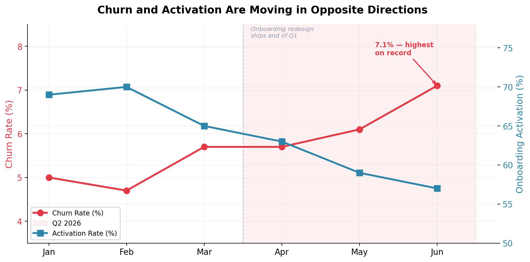
chart1_churn_vs_activation.png | Churn and activation diverging after onboarding redesign |
chart2_onboarding_churn.png | 3.7x churn gap between onboarded vs not |
chart3_churn_by_tier.png | Starter tier as the epicenter |
chart4_nrr_trend.png | NRR dropping below 100% for the first time |
chart5_roi_comparison.png | Cost of inaction vs. the $250K intervention |
The narrative follows the CFO's feedback — story arc, not data dump. It leads the board to a single decision point (rebalance Q3 spend) with a clear financial case and concrete next steps.
Permissions
| Scope | Description |
|---|---|
| filesystem:read | |
| filesystem:write |
SKILL.md
Data Storytelling
Transform raw data into compelling narratives that drive decisions and inspire action.
When to Use This Skill
- Presenting analytics to executives
- Creating quarterly business reviews
- Building investor presentations
- Writing data-driven reports
- Communicating insights to non-technical audiences
- Making recommendations based on data
Core Concepts
1. Story Structure
Setup → Conflict → Resolution

Setup: Context and baseline
Conflict: The problem or opportunity
Resolution: Insights and recommendations
2. Narrative Arc
1. Hook: Grab attention with surprising insight
2. Context: Establish the baseline
3. Rising Action: Build through data points
4. Climax: The key insight
5. Resolution: Recommendations
6. Call to Action: Next steps
3. Three Pillars
| Pillar | Purpose | Components |
|---|---|---|
| Data | Evidence | Numbers, trends, comparisons |
| Narrative | Meaning | Context, causation, implications |
| Visuals | Clarity | Charts, diagrams, highlights |
Story Frameworks
Framework 1: The Problem-Solution Story
# Customer Churn Analysis

## The Hook

"We're losing $2.4M annually to preventable churn."

## The Context

- Current churn rate: 8.5% (industry average: 5%)
- Average customer lifetime value: $4,800
- 500 customers churned last quarter

## The Problem

Analysis of churned customers reveals a pattern:

- 73% churned within first 90 days
- Common factor: < 3 support interactions
- Low feature adoption in first month

## The Insight

[Show engagement curve visualization]
Customers who don't engage in the first 14 days
are 4x more likely to churn.

## The Solution

1. Implement 14-day onboarding sequence
2. Proactive outreach at day 7
3. Feature adoption tracking

## Expected Impact

- Reduce early churn by 40%
- Save $960K annually
- Payback period: 3 months

## Call to Action

Approve $50K budget for onboarding automation.
Framework 2: The Trend Story
# Q4 Performance Analysis

## Where We Started

Q3 ended with $1.2M MRR, 15% below target.
Team morale was low after missed goals.

## What Changed

[Timeline visualization]

- Oct: Launched self-serve pricing
- Nov: Reduced friction in signup
- Dec: Added customer success calls

## The Transformation

[Before/after comparison chart]
| Metric | Q3 | Q4 | Change |
|----------------|--------|--------|--------|
| Trial → Paid | 8% | 15% | +87% |
| Time to Value | 14 days| 5 days | -64% |
| Expansion Rate | 2% | 8% | +300% |

## Key Insight

Self-serve + high-touch creates compound growth.
Customers who self-serve AND get a success call
have 3x higher expansion rate.

## Going Forward

Double down on hybrid model.
Target: $1.8M MRR by Q2.
Framework 3: The Comparison Story
# Market Opportunity Analysis

## The Question

Should we expand into EMEA or APAC first?

## The Comparison

[Side-by-side market analysis]

### EMEA

- Market size: $4.2B
- Growth rate: 8%
- Competition: High
- Regulatory: Complex (GDPR)
- Language: Multiple

### APAC

- Market size: $3.8B
- Growth rate: 15%
- Competition: Moderate
- Regulatory: Varied
- Language: Multiple

## The Analysis

[Weighted scoring matrix visualization]

| Factor      | Weight | EMEA Score | APAC Score |
| ----------- | ------ | ---------- | ---------- |
| Market Size | 25%    | 5          | 4          |
| Growth      | 30%    | 3          | 5          |
| Competition | 20%    | 2          | 4          |
| Ease        | 25%    | 2          | 3          |
| **Total**   |        | **2.9**    | **4.1**    |

## The Recommendation

APAC first. Higher growth, less competition.
Start with Singapore hub (English, business-friendly).
Enter EMEA in Year 2 with localization ready.

## Risk Mitigation

- Timezone coverage: Hire 24/7 support
- Cultural fit: Local partnerships
- Payment: Multi-currency from day 1
Visualization Techniques
Technique 1: Progressive Reveal
Start simple, add layers:

Slide 1: "Revenue is growing" [single line chart]
Slide 2: "But growth is slowing" [add growth rate overlay]
Slide 3: "Driven by one segment" [add segment breakdown]
Slide 4: "Which is saturating" [add market share]
Slide 5: "We need new segments" [add opportunity zones]
Technique 2: Contrast and Compare
Before/After:
┌─────────────────┬─────────────────┐
│ BEFORE │ AFTER │
│ │ │
│ Process: 5 days│ Process: 1 day │
│ Errors: 15% │ Errors: 2% │
│ Cost: $50/unit │ Cost: $20/unit │
└─────────────────┴─────────────────┘

This/That (emphasize difference):
┌─────────────────────────────────────┐
│ CUSTOMER A vs B │
│ ┌──────────┐ ┌──────────┐ │
│ │ ████████ │ │ ██ │ │
│ │ $45,000 │ │ $8,000 │ │
│ │ LTV │ │ LTV │ │
│ └──────────┘ └──────────┘ │
│ Onboarded No onboarding │
└─────────────────────────────────────┘
Technique 3: Annotation and Highlight
import matplotlib.pyplot as plt
import pandas as pd

fig, ax = plt.subplots(figsize=(12, 6))

# Plot the main data
ax.plot(dates, revenue, linewidth=2, color='#2E86AB')

# Add annotation for key events
ax.annotate(
    'Product Launch\n+32% spike',
    xy=(launch_date, launch_revenue),
    xytext=(launch_date, launch_revenue * 1.2),
    fontsize=10,
    arrowprops=dict(arrowstyle='->', color='#E63946'),
    color='#E63946'
)

# Highlight a region
ax.axvspan(growth_start, growth_end, alpha=0.2, color='green',
           label='Growth Period')

# Add threshold line
ax.axhline(y=target, color='gray', linestyle='--',
           label=f'Target: ${target:,.0f}')

ax.set_title('Revenue Growth Story', fontsize=14, fontweight='bold')
ax.legend()
Presentation Templates
Template 1: Executive Summary Slide
┌─────────────────────────────────────────────────────────────┐
│  KEY INSIGHT                                                │
│  ══════════════════════════════════════════════════════════│
│                                                             │
│  "Customers who complete onboarding in week 1              │
│   have 3x higher lifetime value"                           │
│                                                             │
├──────────────────────┬──────────────────────────────────────┤
│                      │                                      │
│  THE DATA            │  THE IMPLICATION                     │
│                      │                                      │
│  Week 1 completers:  │  ✓ Prioritize onboarding UX         │
│  • LTV: $4,500       │  ✓ Add day-1 success milestones     │
│  • Retention: 85%    │  ✓ Proactive week-1 outreach        │
│  • NPS: 72           │                                      │
│                      │  Investment: $75K                    │
│  Others:             │  Expected ROI: 8x                    │
│  • LTV: $1,500       │                                      │
│  • Retention: 45%    │                                      │
│  • NPS: 34           │                                      │
│                      │                                      │
└──────────────────────┴──────────────────────────────────────┘
Template 2: Data Story Flow
Slide 1: THE HEADLINE
"We can grow 40% faster by fixing onboarding"

Slide 2: THE CONTEXT
Current state metrics
Industry benchmarks
Gap analysis

Slide 3: THE DISCOVERY
What the data revealed
Surprising finding
Pattern identification

Slide 4: THE DEEP DIVE
Root cause analysis
Segment breakdowns
Statistical significance

Slide 5: THE RECOMMENDATION
Proposed actions
Resource requirements
Timeline

Slide 6: THE IMPACT
Expected outcomes
ROI calculation
Risk assessment

Slide 7: THE ASK
Specific request
Decision needed
Next steps
Template 3: One-Page Dashboard Story
# Monthly Business Review: January 2024

## THE HEADLINE

Revenue up 15% but CAC increasing faster than LTV

## KEY METRICS AT A GLANCE

┌────────┬────────┬────────┬────────┐
│ MRR │ NRR │ CAC │ LTV │
│ $125K │ 108% │ $450 │ $2,200 │
│ ▲15% │ ▲3% │ ▲22% │ ▲8% │
└────────┴────────┴────────┴────────┘

## WHAT'S WORKING

✓ Enterprise segment growing 25% MoM
✓ Referral program driving 30% of new logos
✓ Support satisfaction at all-time high (94%)

## WHAT NEEDS ATTENTION

✗ SMB acquisition cost up 40%
✗ Trial conversion down 5 points
✗ Time-to-value increased by 3 days

## ROOT CAUSE

[Mini chart showing SMB vs Enterprise CAC trend]
SMB paid ads becoming less efficient.
CPC up 35% while conversion flat.

## RECOMMENDATION

1. Shift $20K/mo from paid to content
2. Launch SMB self-serve trial
3. A/B test shorter onboarding

## NEXT MONTH'S FOCUS

- Launch content marketing pilot
- Complete self-serve MVP
- Reduce time-to-value to < 7 days
Writing Techniques
Headlines That Work
BAD: "Q4 Sales Analysis"
GOOD: "Q4 Sales Beat Target by 23% - Here's Why"

BAD: "Customer Churn Report"
GOOD: "We're Losing $2.4M to Preventable Churn"

BAD: "Marketing Performance"
GOOD: "Content Marketing Delivers 4x ROI vs. Paid"

Formula:
[Specific Number] + [Business Impact] + [Actionable Context]
Transition Phrases
Building the narrative:
• "This leads us to ask..."
• "When we dig deeper..."
• "The pattern becomes clear when..."
• "Contrast this with..."

Introducing insights:
• "The data reveals..."
• "What surprised us was..."
• "The inflection point came when..."
• "The key finding is..."

Moving to action:
• "This insight suggests..."
• "Based on this analysis..."
• "The implication is clear..."
• "Our recommendation is..."
Handling Uncertainty
Acknowledge limitations:
• "With 95% confidence, we can say..."
• "The sample size of 500 shows..."
• "While correlation is strong, causation requires..."
• "This trend holds for [segment], though [caveat]..."

Present ranges:
• "Impact estimate: $400K-$600K"
• "Confidence interval: 15-20% improvement"
• "Best case: X, Conservative: Y"
Best Practices
Do's
- Start with the "so what" - Lead with insight
- Use the rule of three - Three points, three comparisons
- Show, don't tell - Let data speak
- Make it personal - Connect to audience goals
- End with action - Clear next steps
Don'ts
- Don't data dump - Curate ruthlessly
- Don't bury the insight - Front-load key findings
- Don't use jargon - Match audience vocabulary
- Don't show methodology first - Context, then method
- Don't forget the narrative - Numbers need meaning
FAQ
What does data-storytelling do?
Transform data into compelling narratives using visualization, context, and persuasive structure. Use when presenting analytics to stakeholders, creating data reports, or building executive presentations.
When should I use data-storytelling?
Use it when you need a repeatable workflow that produces text report, image output, source code.
What does data-storytelling output?
In the evaluated run it produced text report, image output, source code.
How do I install or invoke data-storytelling?
Ask the agent to use this skill when the task matches its documented workflow.
Which agents does data-storytelling support?
Agent support is inferred from the source, but not explicitly declared.
What tools, channels, or permissions does data-storytelling need?
It uses no extra tools; channels commonly include text, image, code; permissions include filesystem:read, filesystem:write.
Is data-storytelling safe to install?
Static analysis marked this skill as medium risk; review side effects and permissions before enabling it.
How is data-storytelling different from an MCP or plugin?
A skill packages instructions and workflow conventions; tools, MCP servers, and plugins are dependencies the skill may call during execution.
Does data-storytelling outperform not using a skill?
About data-storytelling
When to use data-storytelling
When preparing executive summaries, QBRs, or investor updates from existing analysis. When you need to explain metrics, trends, and recommendations to non-technical stakeholders. When structuring a report or slide deck around insights and business impact.
When data-storytelling is not the right choice
When the task is primarily to perform raw data extraction, modeling, or statistical computation. When you need live integrations to BI tools, databases, or publishing platforms.
What it produces
Produces text report, image output and source code.